Well I come from Hawkesbury with my marketing plan on my knee,
and I’m bound for Montreal, my own true Suzana for to see.
It did snow all night the day I left, the weather was bone cold.
The sun was so bright I froze myself,
Suzana, don’t you go on and cry.
I said, oh, Suzana, now, don’t you cry for Green Beaver,
as you will make this marketing plan on my knee a better reality.
Adapted from “Oh, Susannah” by James Taylor
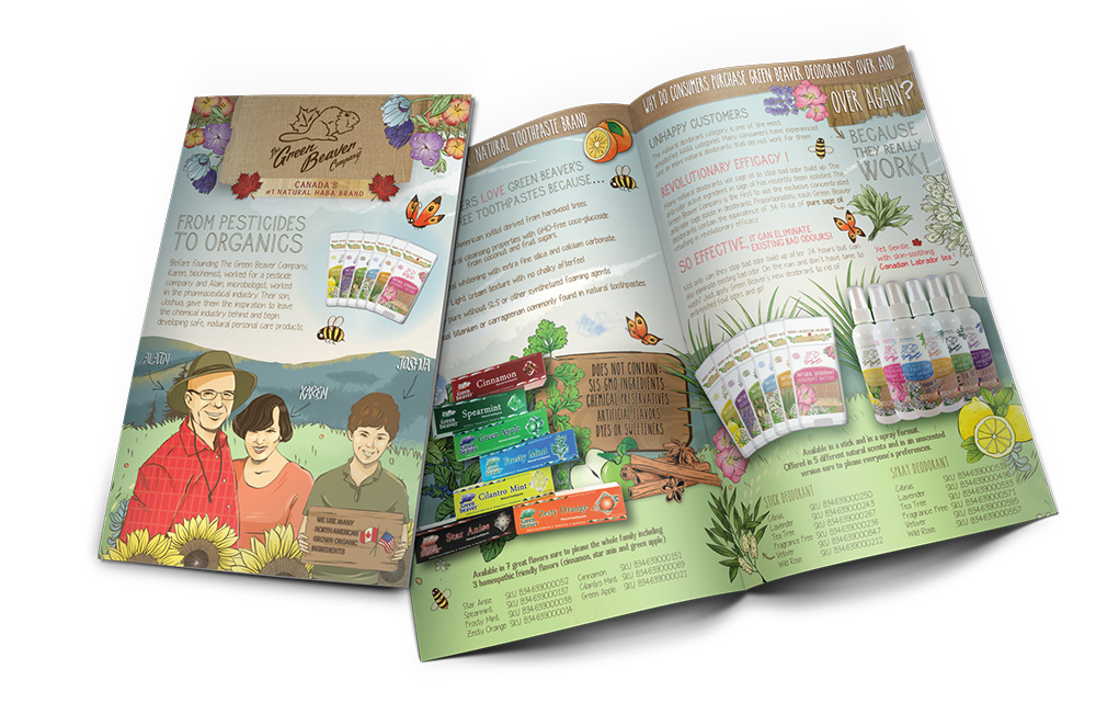
Over the years, we introduced a dozen different product categories from natural toothpastes, deodorants, facial products, sunscreens, etc.
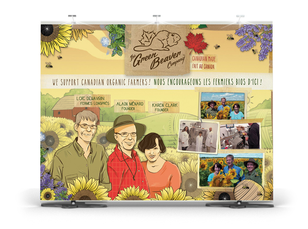
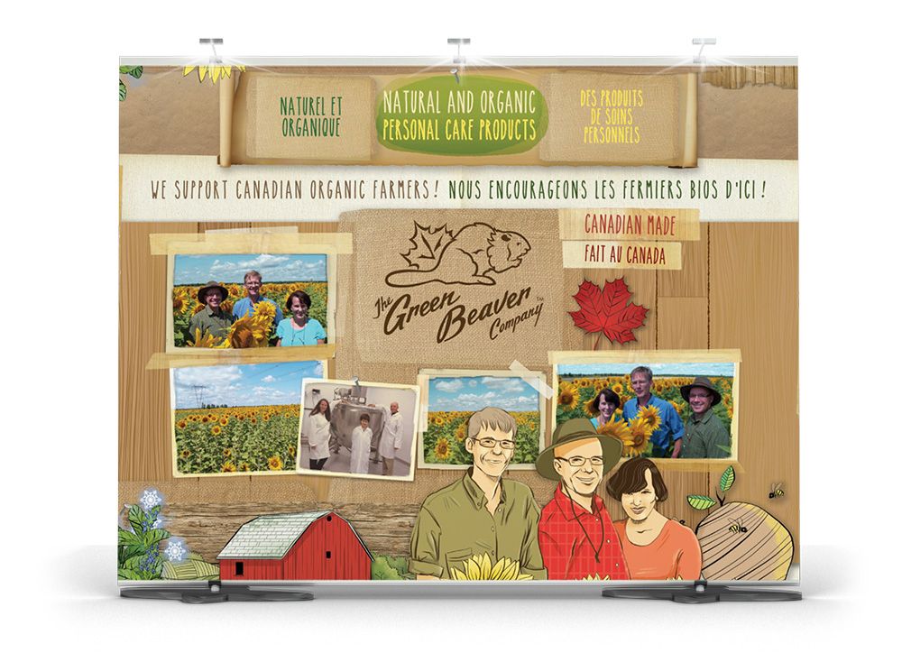
We were two scientists formulating and manufacturing products. Marketing was not our forte. Our product categories all looked different from each other with very little to bring them together. It looked like there was 12 different Green Beaver companies out there ! Suzana and her team were able to capture the essence of who we are and created a look and feel that resonates with our customers. We look forward to continue working with Suzana on consumer awareness campaigns.
PS I’ve worked with major big league agencies during my time in the pharmaceutical industry. None have come close to Suzana’s work!


