GREEN BEAVER BOREAL LINE

Packaging Design • 3D Mockup & Render • Custom Illustrations

The folks at Green Beaver have an amazing organic cream line they used to call ‘Winter Therapy’. This collection of creams and lip balm are amazing at tackling dry skin, which we have so much of in our cold Canadian climates!

As you probably know, The Green Beaver Company is a Canadian company, well known worldwide for it’s focus on naturally created, locally sourced and organic skin care products. We were commissioned to gradually redesign all of their packaging materials to match their new branding.

We wanted to re-brand the line to make it a more of an ‘all-season’ type cream, which people with extremely sensitive skin could benefit from. The first step we took was to keep the original color of blue as to not stray from consumer familiarity, and to keep it all tied in as a line. Next we infused the design with hand-drawn labrador tea flowers and delicious creamy Shea butter to really emphasis the all-natural ingredients.

For the lip balm, we had to stick with two pantone colors, but we really articulated the display to entice the consumer to give it a try.

Labrador Tea

Shea Butter

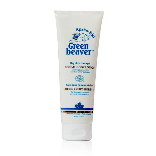
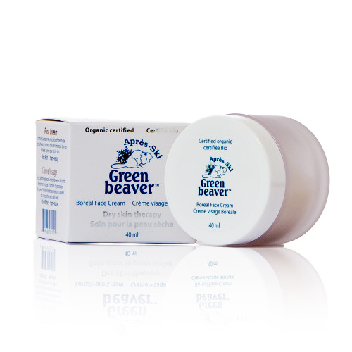
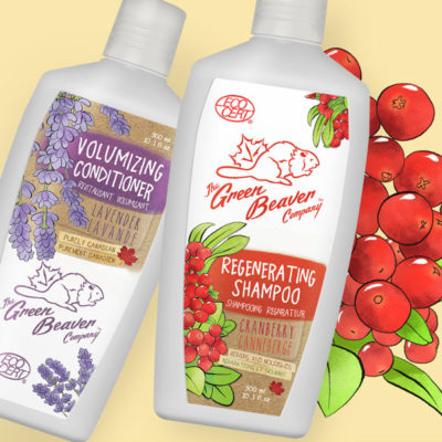
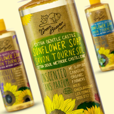
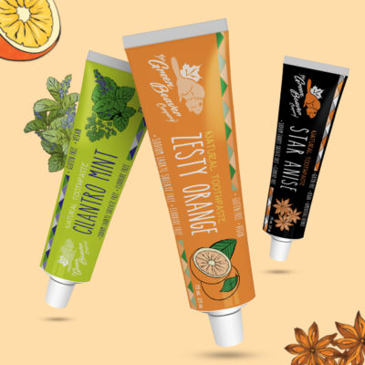
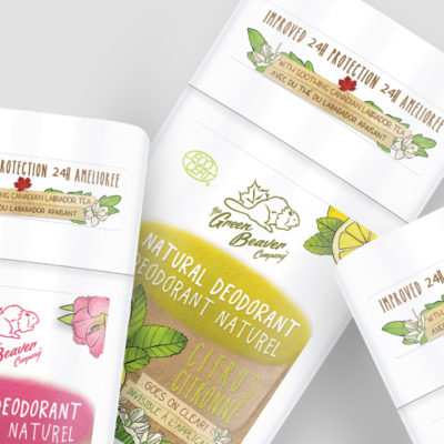
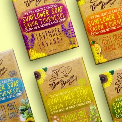
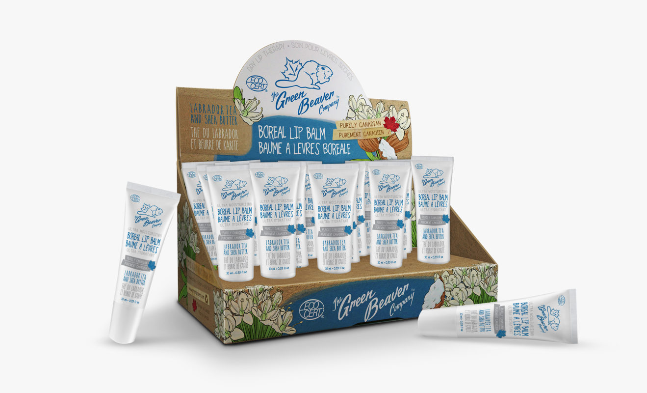
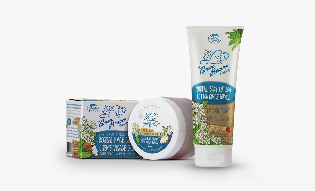
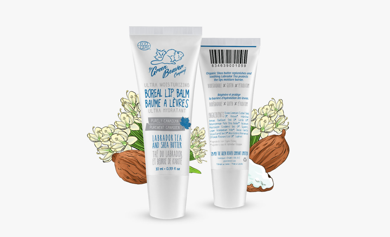
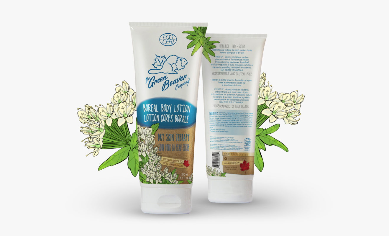
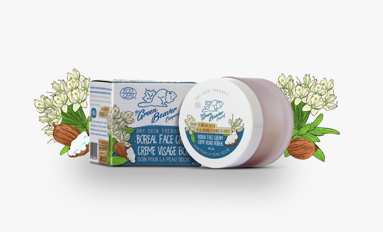
BOREAL LINE BEFORE REDESIGN

It’s always fun to see the before and after of a redesign! These were designed by Jean-Martin, the Marketing Director at Green Beaver – and they won many awards! However, it was time for a change. All die-lines were kept the same, and the design was created to match the overall new Green Beaver look.

Well I come from Hawkesbury with my marketing plan on my knee,
and I’m bound for Montreal, my own true Suzana for to see.
It did snow all night the day I left, the weather was bone cold.
The sun was so bright I froze myself,
Suzana, don’t you go on and cry.
I said, oh, Suzana, now, don’t you cry for Green Beaver,
as you will make this marketing plan on my knee a better reality.

Adapted from “Oh, Susannah” by James Taylor

Over the years, we introduced a dozen different product categories from natural toothpastes, deodorants, facial products, sunscreens, etc.

We were two scientists formulating and manufacturing products. Marketing was not our forte. Our product categories all looked different from each other with very little to bring them together. It looked like there was 12 different Green Beaver companies out there ! Suzana and her team were able to capture the essence of who we are and created a look and feel that resonates with our customers. We look forward to continue working with Suzana on consumer awareness campaigns.

PS I’ve worked with major big league agencies during my time in the pharmaceutical industry. None have come close to Suzana’s work!

Alain Ménard • President at The Green Beaver Company

Green Beaver Boreal

We redesigned The Green Beaver Company’s Boreal line. We designed beautiful blue toned packaging that aligned with the rest of the product line, but had a distinctive wintery feel.